As of today, nzarchitecture.com is now danieldavis.com. In addition to the name change, I redesigned the site in an effort to unify the blog and portfolio – the site’s fifth major redesign. In this post I look back at the various incarnations of nzarchitecture.com and explain why it was time to retire the name.
NZ Architecture
Eight years ago, as a first year architecture student, I purchased nzarchitecture.com. This was 2005 and not many New Zealand architecture firms had websites (many still don't). The few websites that existed were awful Flash based labyrinths buried under preloading animations and mystery meat navigation. My first website stuck to this theme:
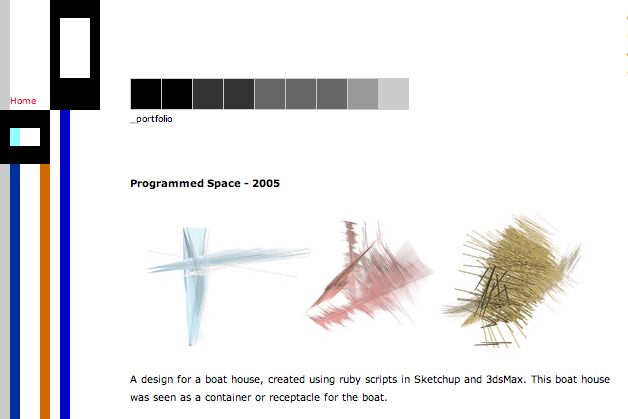
That gradient of grey squares is the menu, those stripes of colour on the left are ugly, but scripting in Sketchup and 3dsMax back in 2005 is pretty cool.
My second attempt was equally perplexing:
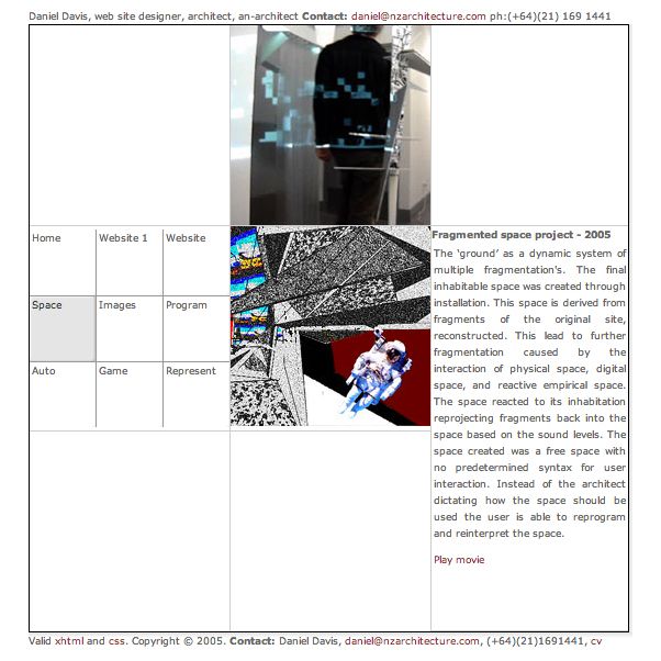
The navigation is a literal map to the website and changes location in the nine-square grid depending on the page. Super confusing!
During the summer break after my first year of study, I redesigned nzarchitecture.com for third time:
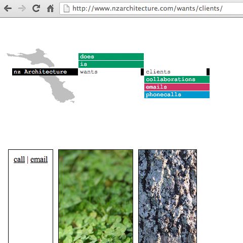
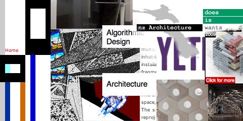
Visitors to the third iteration created sentences using the navigation. In this case, nz Architecture wants clients, which also becomes the url.
I had become interested in how the internet shifted power structures; how a student has the same materials from which to build a website as any large architecture firm. I figured that I couldn’t build an office as good as them, but I might be able to build a comparable website. I optimised nzarchitecture.com to rank highly for certain keywords, and often appeared in Google’s search results higher than the New Zealand Institute of Architects, my university, and many of the major New Zealand architecture firms. Nothing more than amusement came of this. In my eight years of owning nzarchitecture.com only one person has contacted me unsolicited: a man after free advice on setbacks for a shed. I do however receive one or two emails every week asking for a job, which serve as these sad weekly reminders of architecture’s peril.
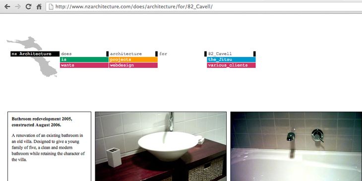
An indication of how far architecture has fallen: the same summer I made this website, after studying architecture for only one year, I did my first and only ‘true’ architecture work. Three renovations and a restaurant design. Eight years later, I’m not sure I could ever do the same.
Blogging
Hidden inside all these early versions of nzarchitecture.com were secret buttons that either activated little HTML experiments or revealed badly photoshopped pictures of my boss. One hidden pixel opened my blog, which was more like a diary at that stage – Tumblr meets Facebook before either existed.
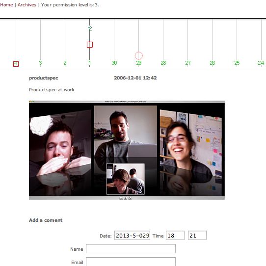
The timeline on the top navigated through the entries. Each entry was either a square (indicating an image) or a circle (indicating text). The position of the entry was based on its time of publication and the size was based on how much content it held.
There is nothing to be found in these early blog entries except for nostalgia. It is nice having a record of the moment, two months into studying architecture, I searched for 'automation in architecture' on the library catalogue and was introduced to the idea of computational design:
I found this kick-ass book, 'The Automated Architect' by N. Cross (NA2728 CY16). No one had got it out since 1988. It was about using computers in the 1970s and 60s to make plans of houses automatically. Kind of disapointed because I thought it was my idea. Why cant we design houses based on the optimum levels of flow, heating, cost etc. Build computer algorithms to generate individualised housing for the masses – stop spending time solving the same design problems repedativly. I guess there is more to it than that, and it has already been done (in the 60s!), so there goes one of my big ideas. – entry from the 2 April 2005
In 2008, at the end of my forth year, I redesigned nzarchitecture.com for the final time. The blog was still hidden but as I began my PhD in 2010 I made it public and deleted the old entries.
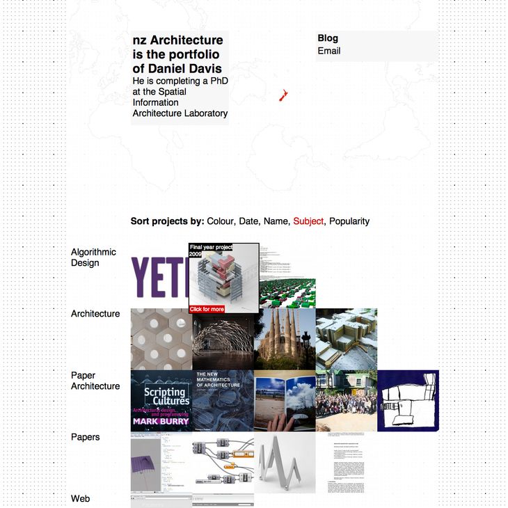
The final design of nzarchitecture.com. Rather than clicking through navigation to get to the projects I reduced the site to a single page showing all the projects at once.
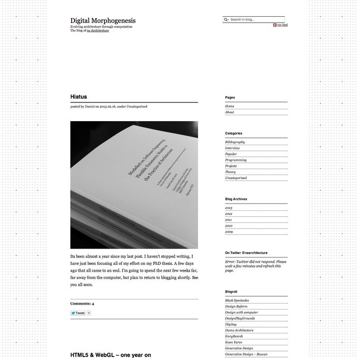
The blog on nzarchitecture.com slowly became the primary focus, although it always existed as almost a separate entity.
danieldavis.com
The technology of the internet changes rapidly. When I first created nzarchitecture.com, Internet Explorer 6 was the dominant browser (IE7 hadn’t been released) and 800 x 600 was the primary screen size. Webdesign was a painful occupation. Today people access this site primarily using the Chrome browser (31% of you use it) and either using high resolution monitors (1920 x 1080) or using their phone. I set out to redesign nzarchitecture.com to take advantage of the technological advances; to be accessible on all devices, to have larger images, and to have better typography.
As I redesigned nzarchitecture.com I also became aware that site had an identity issue. While it was somewhat funny to hide behind the facade of New Zealand architecture, I realised that more and more what I was doing was happening outside of New Zealand and perhaps even outside of architecture. My blog had transitioned from this hidden, password-protected secret to being the main part of the website, yet it was named Digital Morphogenesis and hosted as a sub-domain at nzarchitecture.com.
I decided to get rid of all the bullshit and simplify everything. I tracked down the man who owned danieldavis.com and after a month of negotiation I paid a fairly large sum of money so it would say danieldavis.com at the top of this page. And here we are, a new URL and a new design – hopefully the last of both.

Flora Salim
Congrats for getting your domain name.I hope you're not releasing the ownership of nzarchitecture.com as somebody would want it in the future I guess. Domain resellers make a good business.
Daniel
Thanks Flora, I now know too well what a good business domain reselling is! I'll keep nzarchitecture redirecting here for the time being and work out what to do with it in the future...
Francois Breedt
Congrats Daniel, I was wondering when it was going to happen. You should sell NZ Architecture .com for a very Large sum of money:) Or Just keep it. Let the search for architecture in nz continue..:)
Daniel
Thank you Francois! Hope all is well in Auckland, I spied your former boss in the elevator over here to get his PhD too....