Like my previous post on the history of parametric design, this post is another B-side from my PhD thesis. It considers how parametric modelling might inform typography, which was an idea I explored in my thesis but eventually discarded.
For two years I studied how parametric design was impacting the practice of architecture. I had three case studies, a number of smaller experiments, background literature, and the official blessing to being writing my thesis. At this stage I did what most people do when asked to write what is essentially an 80,000 word essay: I began procrastinating.
I began developing a parametric model to layout my thesis, a project I justified by calling it my ‘forth case study’. The first three case studies explored parametric modelling in the context of architecture, this forth case study was to extend the argument into a wider practice of design. The thesis itself would become supporting evidence for the text within. Since much of my thesis assessed how parametric model flexibility was impacting the practice of architecture, I was interested in what this flexibility would do to graphic design. Could the layout begin before I finished writing? Could I make last minute changes to both the text and the design without either being disruptive? Could the medium and the message co-evolve together? What would this look like?
 for Wired 05 (2011). These contemporary digital designs make reference to the historic tradition of hand crafted initials. Right: An initial in the Mainz Psalter (1459).](/img/b_initials-hO_j7nGJMY-730w.jpeg)
Left: An initial designed by Jonathan Puckey for Wired 05 (2011). These contemporary digital designs make reference to the historic tradition of hand crafted initials. Right: An initial in the Mainz Psalter (1459).
Visually I was inspired by the initials and embellishments that Wired magazine commissions from designers. Each article has a unique feel but there are underlying rules that make the overall issue feel cohesive. I also found inspiration in an number of logos that exhibit a similar parametric quality (see images below). The City of Melbourne (where I currently live) has a “flexible logo”, which is the silhouette of a three-dimensional ‘M’ overlaid with patterns that change based on context. MIT Media Lab has forty-thousand computationally generated logos, each thematically similar but visually different. And Pepsi’s new logo (2008) derives from a set of geometric rules that enable each product to have a different permutation of the logo. I find these examples curious because brands typically become recognisable through repetitive exposure. Companies go to great lengths to ensure a brand’s colours, spacing, silhouettes, and sizes are always the same in order to improve the likelihood a customer will identify them. These examples seem to flip this thinking on its head. Jose Salmeron, writing in Smashing Magazine, calls them “fluid brand identities”. They embrace visual variation and find paradoxically stable identities within it.
.](/img/1106151249291515-1-WhZXAaIDMQ-600w.jpeg)
Variations on City of Melbourne identity developed by Landor. Source.
.](/img/MITMediaLab_The_4-1-1Dvopr1bDR-650w.jpeg)
Twelve of the forty-thousand possible MIT logos. Each is generatively created. See this article on the rebranding.

The geometric rules that define the family of Pepsi logos.
.](/img/new_pepsi-jNo2kchqSG-635w.jpeg)
Various instances of the Pepsi logo generated from the model. Pepsi uses a slightly different logo for each of its products. Source.
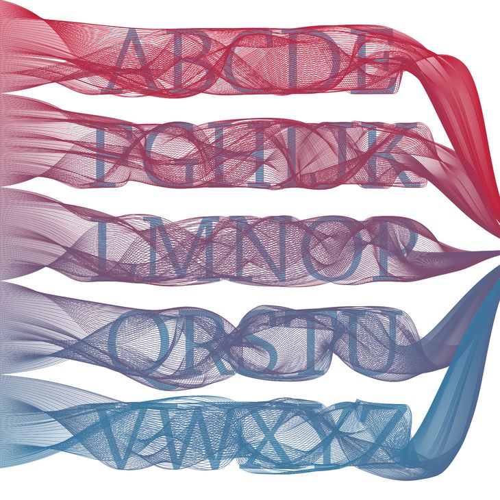
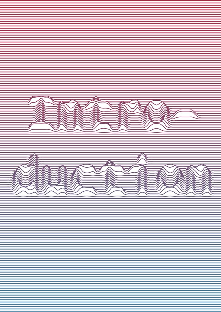
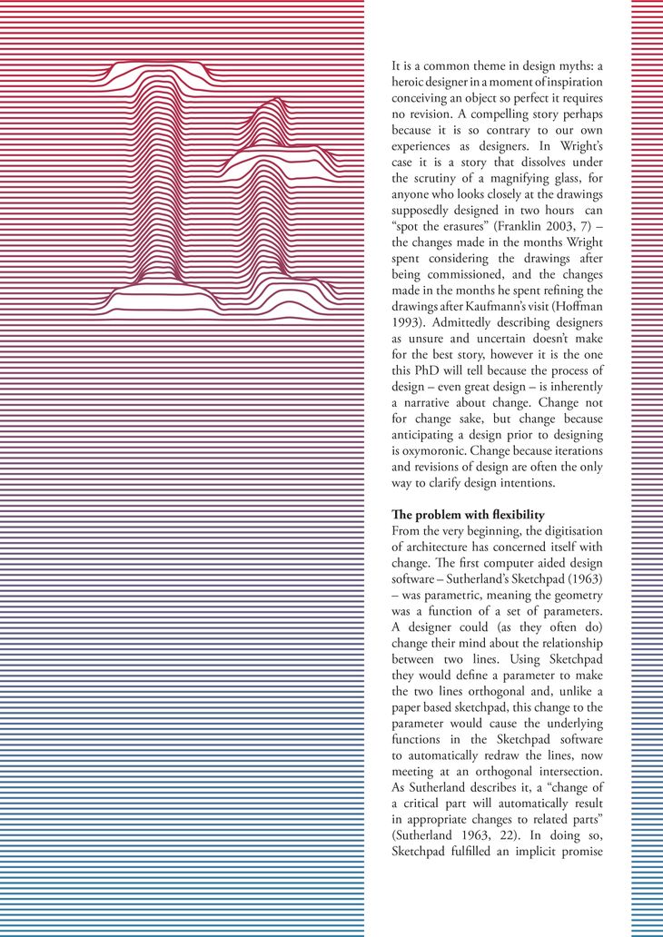
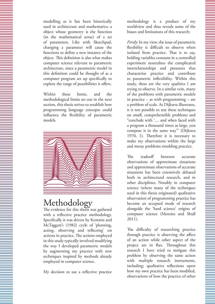
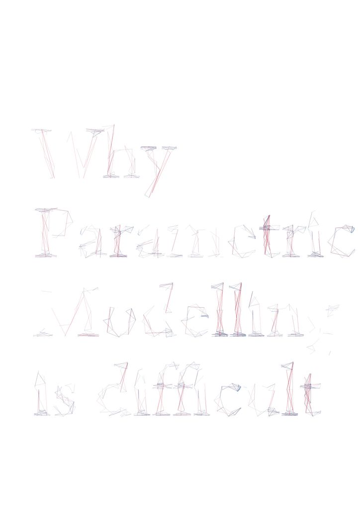
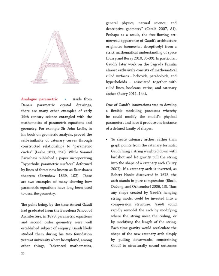
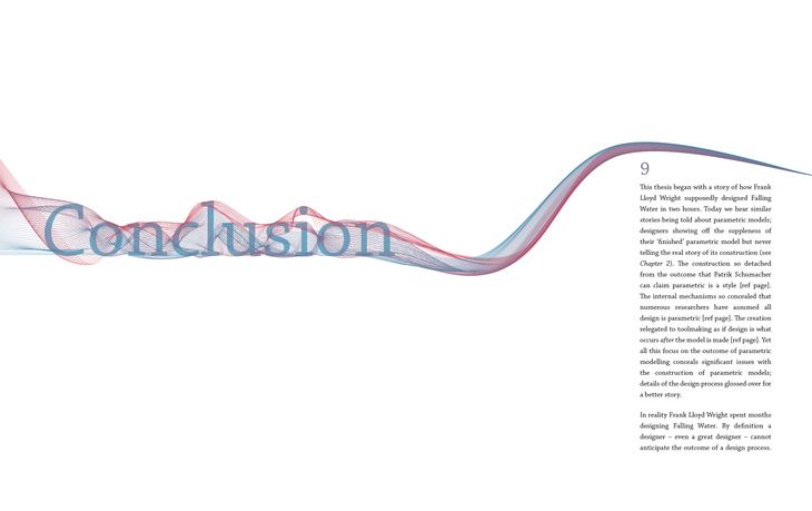
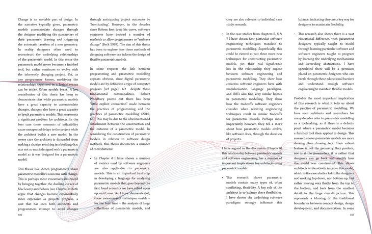
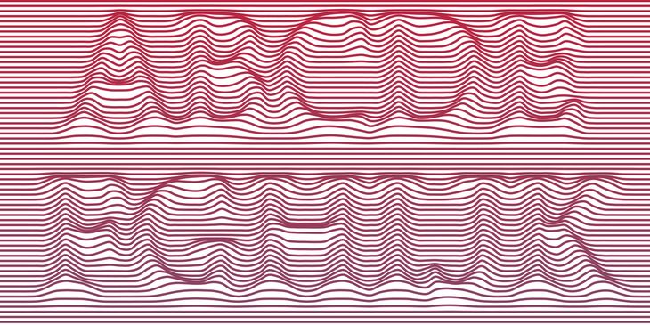
Inspired, I began designing my thesis with a parametric model. Instead of the rigid consistency of Indesign templates there would be computationally generated layouts that were unique on every page. These would be unified through a system of proportions and gridlines. There would be a single font used in the entire thesis. Rather than the font being an outline filled with colour it would be the input for various parametric models. Each chapter having a model that interpreted the font differently; each title, each drop-cap slightly unique. (You can see the results at the end of the post).

I worked on this when I lacked the inspiration to write (which was quite frequently). I ended up developing a fairly elaborate system in Java/Processing that would read text files from Scrivener, generate PDF’s of all the title pages and other embellishments, before linking everything together in an Indesign XML file.
I was in love with the system I had created. My infatuation was so strong that I couldn’t think critically. When I showed my supervisors I thought we would have a long discussion about the ramifications for the graphic design industry. Instead they told me it looked overdone and childish. Initially I thought they were concerned that I had spent more time writing code than writing prose, but after a few more months of stubborn persistence I came around to their view.
Visually it is too much. The graphics overpower the text, the message lost in the medium. Worse still, the parametric models were this pastiche of common parametric tropes. While my text tried to elevate the academic discussion of parametric modelling, the design was essentially parametricism for books. I started over. My thesis now looks much like any other but below you can see some designs that never were. I have also included the Processing source code for the fonts from each chapter (Creative Commons, attribution). Perhaps you can find a use for them. I still like the idea and even if the designs don’t intellectually meet my aspirations they have something that I find visually compelling.
It wasn’t a wasted exercise though. In another post I will explain how I used these computational techniques to layout my much more conventional final thesis. And the logo for this site, the colours, the drop-caps, and the fonts, all derive in some way from these experiments.
Chapter 0
.](/img/ch0-0xBsDfYSrX-730w.jpeg)
Click images for detail. Chapter 0 is based on 'Mathematical Type' by Tiemen Rapati.
Chapter 1
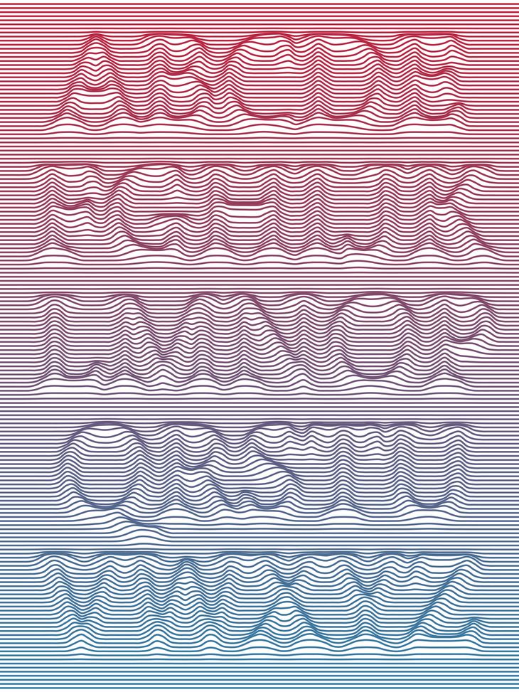
Chapter 2
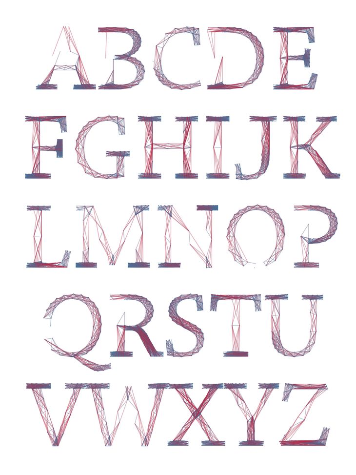
Chapter 4
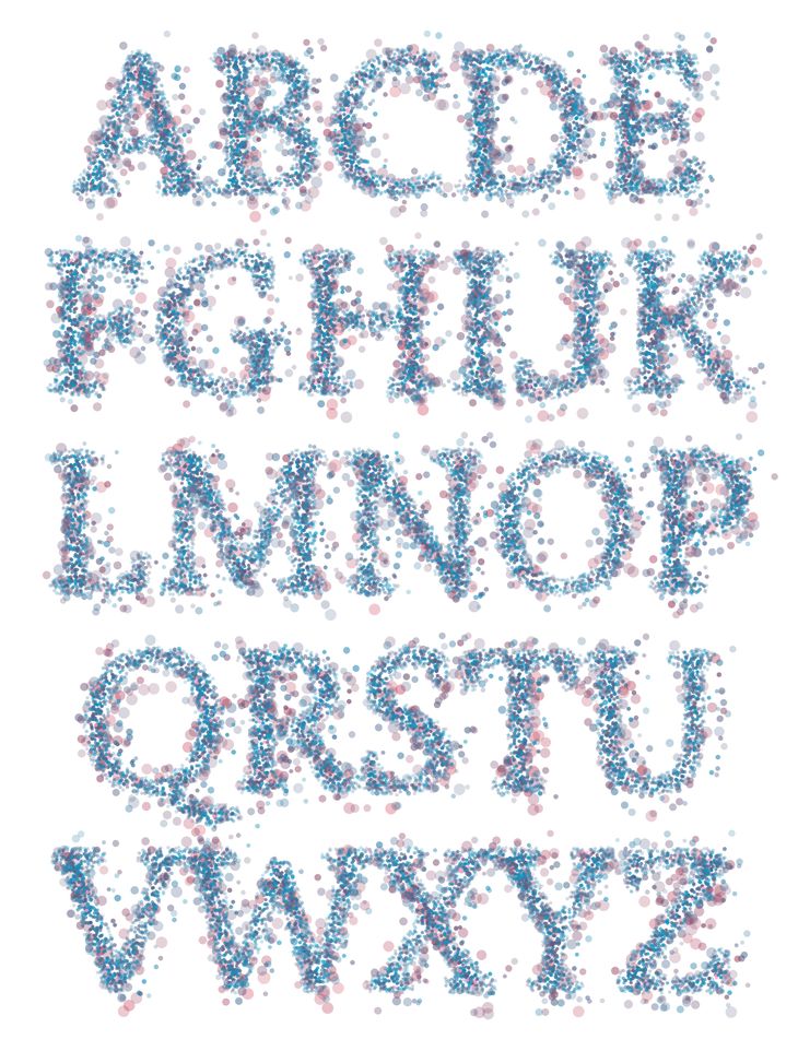
Chapter 8
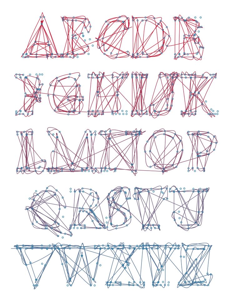
Chapter 9
Sample Spreads
Further Resources
- Flickr Generative Type Group
- Reza's Typography Experiments
- Generative Typography on Open Processing
- The Meta Font (thanks Tomás for suggesting this in the comments)
- Avería - the average font (thanks to Benjamin)
- The Letter Spirit Project (thanks to BitCraftLab)
- The Whitney Museum in NYC has a responsive 'W' logo
zayad motlib
Dear Daniel;
Thanks for sharing these interesting experiments. I shared this link on my facebook community page d-NAT.
I tried to access the processing files, but the provided link gives me an Error 404 - Page Not Found. Any idea?
Thanks zayad
Daniel
Hi Zayad,
Thank you for sharing. I added the wrong URL to the download. Sorry about that! Please try it now.
Daniel
Giorgio Gurioli
ciao very nice, complimenti giorgio
tomás
Nice.
Are you familiar with Metafont?
http://en.wikipedia.org/wiki/Metafont
Developed by Donald Knuth (Tex) in the late 70's. Douglas Hofstadter talks about it while discussing creativity and parametrics in his 1982 essay "Variations on a theme as the Crux of Creativity".
best,
tomás .
Daniel
I'd never come across the Meta Font. Thank you for sharing it Tomás, it is really interesting. I particularly like that illustration in Variations of a Theme that shows a font transitioning from serif to sans-serif down the page. I've added a little resources section to the end of the post so that others can see it.
tomás
Thank you for the blog, i got introduced to it very recently. I'm finishing my PhD myself this year and there is a lot of pointers here for me to look at and learn from.
tomás .
Amruta Tekade
Hey Daniel,
I work as a graphic designer and studing the typography created by you was pretty interesting. Hence i thought should thank you.
Well came across your blog while doing some basic desktop research for 'Parametric in Architecture'.
Thanks a lot for the inspiration and good read!
cheers, Amruta
Daniel
Hello Amruta,
It's great to know that someone outside of the computational design community found the article interesting. Do you have a link to your husband's parametric-looking paper art?
Daniel
Amruta Tekade
yes, sure you can go to
http://www.behance.net/gallery/My-Firsts/4843201
http://www.behance.net/gallery/Patterns-in-the-Futuristic-Architecture/4843515
Daniel
Those have a beautiful motion and calmness about them. Thank you for sharing them!
Amruta Tekade
Nice observation: motion and calm together. thank u too!